
Office Wayfinding Sign Production: Materials and Updates
A historical oak-and-vinyl production project shows how wayfinding components can combine permanent location cues, changeable tenant names, readable contrast, and approved mounting details.
Key takeaways
- A wayfinding system should be planned around decision points and consistent destinations, not as a collection of isolated decorative signs.
- The documented oak-and-vinyl sign separates a permanent floor identity from a tenant name that can be updated.
- Contrast, type size, viewing angle, glare, lighting, and competing visual elements determine whether a sign reads when someone needs it.
- The customer’s qualified team must approve the destination schedule, placement, accessibility, life-safety, and code criteria before production.
- Standoff holes and hardware must follow an installer-approved wall and mounting design—not only the desired shadow line.
Wayfinding signage helps visitors and employees move from arrival to destination without repeatedly stopping to ask for directions. It also contributes to the tone of an office, clinic, studio, or shared commercial floor—but visual style should support the route, not compete with it.
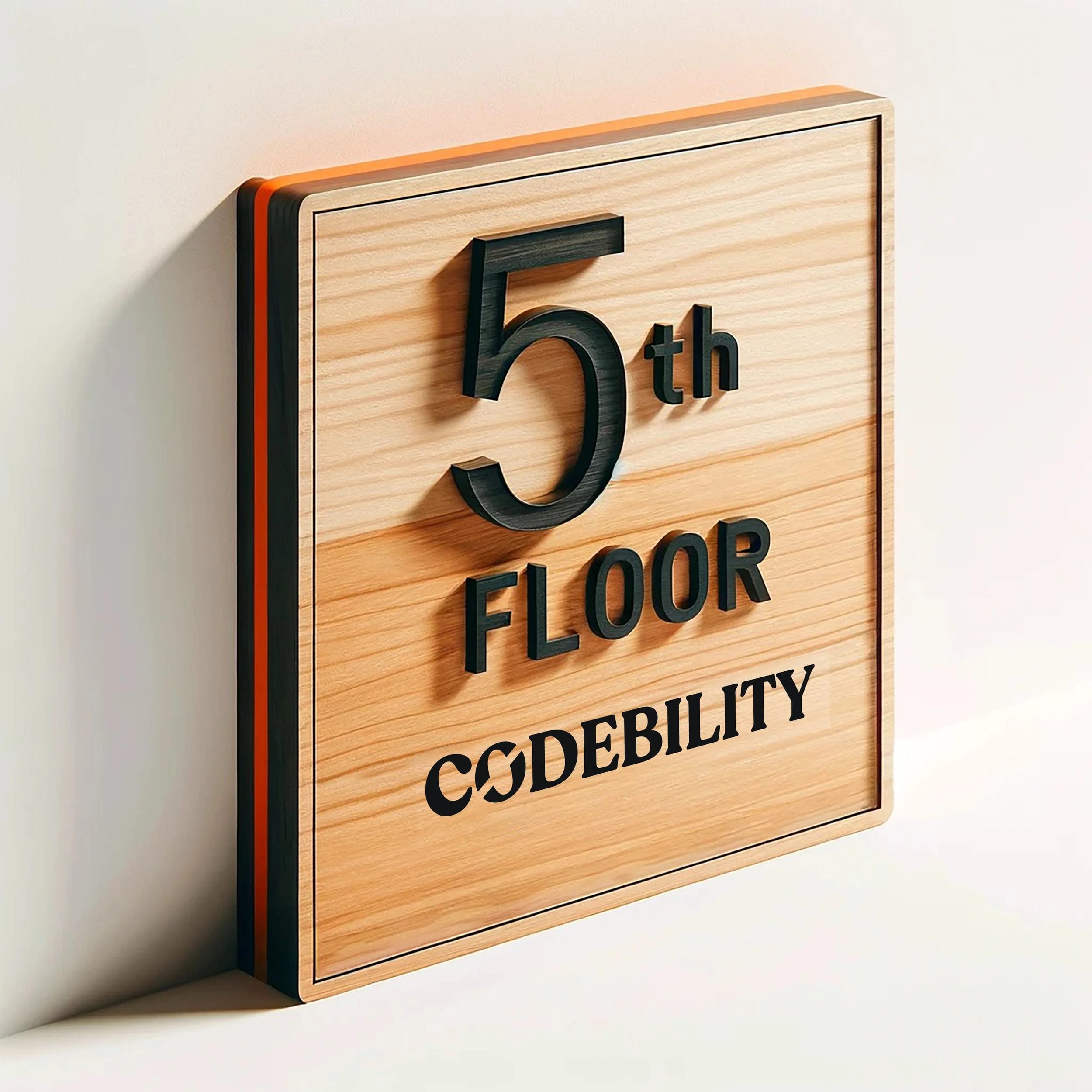
LA Prime Signs documents the historical office sign shown here, which reads “5th FLOOR” and “CØDEBILITY.” Its location is not specified, so it is not presented as Los Angeles-local proof. The project combines oak, black lettering, orange edge color, replaceable vinyl, and standoff mounting.
For current projects, LA Prime Signs produces wayfinding and room-sign components from customer-approved schedules, artwork, dimensions, and specifications. The customer and qualified professionals remain responsible for site surveys, field measurements, placement strategy, accessibility and code decisions, mounting design, structural suitability, permits, access, and installation.
What makes wayfinding signage effective?
YAROOMS' overview groups wayfinding signs into directional, informational, identification, and regulatory roles. This portfolio piece is primarily identification: it names a floor and tenant. A complete building system may need all four roles connected by consistent destination names, arrows, symbols, and placement.
People need information before they commit to a turn. That makes entries, elevator lobbies, reception zones, and corridor junctions more important than empty wall space. Type size, contrast, reading distance, lighting, glare, and visual clutter should be tested from the actual approach.
Decorative identification or directional signs should not be assumed to replace required tactile, Braille, room-identification, egress, or life-safety signs. Applicable accessibility and building requirements need project-specific review.
Materials: Why oak wood and vinyl?
Oak grain adds warmth and visual texture. The project specification identifies “5th FLOOR” as a permanent black wood element and “CØDEBILITY” as removable vinyl. That split is the strongest idea in the example: stable location information can remain while a tenant name is designed to change.
Replaceable does not mean consequence-free. Vinyl, adhesive, finish, cleaning method, age, and sun exposure can affect whether a graphic removes cleanly. A sample and written update plan help avoid ghosting or finish damage later. Buildings with frequent tenant changes may be better served by inserts or dedicated changeable panels.
Design details: Color, contrast, and edge treatment
The documented sign has vivid orange edges and a thin black inset line around the perimeter. That combination does two things:
- Separates the panel from its surroundings. The orange edge creates a recognizable accent when the sign is viewed obliquely.
- Defines the object. The black inset line frames the face and reinforces the panel's depth.
Color is useful only if the message remains legible. Brand colors should be checked under the site's lighting and against the wall finish; a dramatic edge cannot compensate for low-contrast lettering or type that is too small at the decision point.
How standoff details affect production and handoff
This sign is mounted with metal standoffs that lift the panel away from the wall. Standoff mounting can provide:
- A defined shadow line. Separation from the wall makes the panel read as an architectural object.
- Visible, orderly hardware. Matching caps can make attachment points part of the design.
- Service access. Some systems allow a panel to be removed for updates, depending on the hardware and location.
The mount still has to suit the substrate behind the finish wall, panel weight, projection, public contact, cleaning, and any accessibility constraints. The customer’s qualified installer should approve the site-specific attachment plan, final hole pattern, and hardware specification before holes are produced.
How this approach can inform flexible workplaces
This permanent-and-changeable system can inform offices, clinics, labs, studios, and multi-tenant buildings. It is:
- Layered. The wood, lettering, edge color, and hardware each have a distinct job.
- Potentially updateable. Tenant-specific information can change without remaking permanent location cues when the finish system is designed for updates.
- Adaptable to a larger standard. The material language can extend to directories and room signs while destination names and arrows stay consistent.
Interior lighting can range from bright glazed lobbies to dim internal corridors. Test samples in the real light and from the real approach; glare and backlighting can change an otherwise attractive material combination.
What to supply for wayfinding-sign production
A production brief should separate the approved content and fabrication scope from field decisions handled by the customer’s project team:
- What stays and what changes? Separate building, floor, and room information from tenant or department names that need routine updates.
- Where does someone choose a direction? Supply a customer-approved route plan and destination schedule covering arrival, elevators, reception, corridor junctions, and final destinations.
- What must be read, and from where? The customer’s designer should approve message length, type size, contrast, symbols, arrows, viewing distance, and available decision time.
- What requirements apply? Supply approved accessibility, life-safety, landlord, brand-standard, and jurisdictional criteria rather than asking the production shop to determine them.
- What is behind the wall? The qualified installer should verify drywall, concrete, masonry, glass, utilities, blocking, and the mounting pattern.
- Who will maintain it? Define how names are updated, finishes are cleaned, and damaged parts are replaced.
Review wayfinding and room-sign production and the installation-ready handoff guide, then request a production quote with the approved floor plan, destination schedule, artwork, final dimensions, quantities, materials, finish direction, and installer-supplied mounting details.
FAQ
What materials work best for indoor wayfinding signs?
There is no single best material. Hardwood can bring warmth, metal or acrylic can support a cleaner technical look, and vinyl can make selected names updateable. Fire-performance, cleaning, durability, accessibility, mounting, and brand standards should guide the specification.
Can tenant names be changed without replacing the whole sign?
Yes, when the sign is designed as an updateable system. Keep stable information in durable permanent elements and place tenant or department names on a replaceable insert or compatible removable graphic. Confirm that removal will not damage the finish.
How should wayfinding signs be positioned in an office?
Information generally belongs before or at decision points such as entries, elevator lobbies, reception areas, and corridor junctions. The customer’s wayfinding designer and other qualified professionals must approve exact locations, sightlines, reading distances, lighting, accessibility, and the complete route.
Why use standoff mounting instead of flush mounting?
Standoffs create separation and a shadow line that can suit an architectural interior. They are not always the right mount: a qualified installer must verify wall construction, panel weight, tamper resistance, accessibility, cleaning, projection, public contact, and the attachment design.