
Font Selection for Painted Signs: Readability First
The right typeface is not simply “on brand.” It has to remain recognizable at the intended distance and speed, fit the surface and painting method, reproduce legally, and preserve any accessibility or property requirements.
Key takeaways
- Begin with viewing distance, angle, speed, message length, sign size, lighting, and background—not a favorite font category.
- Letter width, stroke, spacing, counters, and word shape can matter as much as nominal letter height.
- Scripts and decorative faces can add character, but they usually need short wording, generous scale, and a secondary role.
- Painted lettering must suit the brush, mask or stencil method, surface texture, color separation, and desired hand-made character.
- Confirm font licensing, logo standards, landlord criteria, and applicable visual or tactile sign requirements before production.
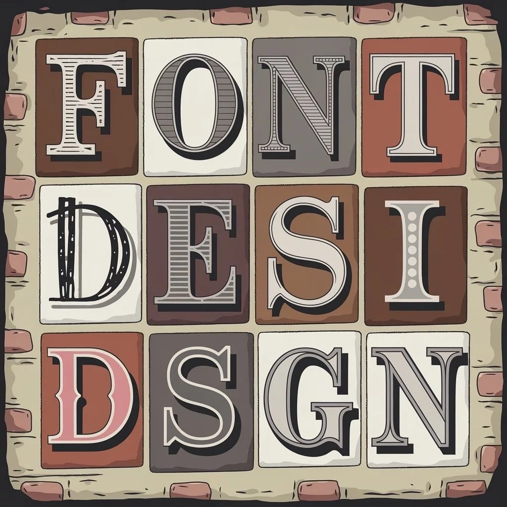
Signs are read under pressure that brochures and websites do not share. A customer may see a storefront name from an angle through reflected glass, a parking-lot directory while moving, or a hand-painted wall from only a few feet away. Font choice must respond to that encounter.
Across Los Angeles and Southern California, the same identity may appear on a pedestrian-oriented storefront and a retail center approached by car. Strong light, shade, facade texture, sign-band proportions, landlord criteria, and paint method can all change which version of the typography works.
LA Prime Signs produces hand-painted signs and painted sign components in the shop from approved artwork and customer-verified dimensions. It does not survey or measure the site, paint walls or facades in the field, determine code or accessibility compliance, or install the finished work. The customer, designer, and qualified installer remain responsible for those site decisions and approvals.
Why does font selection matter for a painted sign?
Typography establishes voice and organizes information, but it does not control behavior by itself. Adobe's overview of font associations is useful for discussing broad design cues; those associations vary by wording, brand, culture, industry, and execution and should not be treated as psychological guarantees.
On a sign, the practical test is whether the intended viewer can identify the word quickly and in the correct order. A typeface that feels expressive up close may lose counters, merge letters, or break into visual noise once painted on a textured wall or seen from a vehicle.
How do common font categories behave on signs?
Categories help narrow options, but evaluate the exact face and wording. Two sans serifs can differ dramatically in width and distinguishability; two scripts can have entirely different joins and flourishes.
Serif fonts
Serifs can support a traditional, editorial, or refined tone. Fine hairlines and small bracket details may disappear at distance or become difficult to paint consistently. Choose a weight and size that preserve the important forms on the actual surface.
Sans-serif fonts
Many sans serifs offer clear silhouettes and simple stroke logic, which can help identification. Geometric faces with similar letters or tightly closed apertures can still be difficult. Inspect C/G, I/l/1, O/0, and rn/m combinations present in the real message.
Script fonts
Script can add warmth, motion, elegance, or a hand-made quality, but its connections and flourishes need space. It is usually strongest in short wording or a familiar logo rather than long directions, suite information, or a name that must be decoded quickly.
Decorative and display fonts
Display faces can create a memorable focal point when the concept suits the business. Use them selectively and keep critical supporting information in a more legible companion. Novelty should not obscure spelling or hierarchy.
What makes painted lettering readable at the site?
Readability is a system. Size alone cannot compensate for weak contrast, extreme compression, long wording, a poor angle, glare, or a typeface with ambiguous characters.
Letter height, width, and viewing conditions
Signs.com's letter-height guide offers a common distance heuristic, but it is not a universal specification. Viewing speed, setback, angle, mounting height, letter width, message familiarity, lighting, and obstructions can require a different result. Mock up the exact wording at scale and view it from the real approach.
Color and luminance contrast
Foreground and background need enough separation in the relevant light. Similar-value brand colors can merge even when their hues differ. Test paint or material samples against the facade in sun and shade, and check day-versus-night behavior if the sign is illuminated.
Stroke, spacing, and word shape
Overly thin strokes disappear; overly heavy strokes can close counters. Tight tracking can merge letters, while loose spacing can break a word apart. Optical spacing around curves, diagonals, capitals, and scripts often needs adjustment beyond the font's default settings.
Surface and approach
Rough stucco, brick joints, wood grain, reflective glass, panel seams, and shadows can interrupt fine detail. A sign seen perpendicular to a sidewalk has different time and angle constraints from one facing a parking lot. Include those conditions in the layout instead of choosing on a blank screen.
How should typography align with the brand?
Start with the existing logo and brand standards. Identify which lettering is a protected logotype, which text may use a companion font, and what alterations require approval. A painted interpretation can preserve character, but it should not casually redraw a trademark or replace a distinctive form without consent.
Use type to support the brand's actual tone—direct, playful, formal, quiet, technical—without assigning a guaranteed personality to a font category. Keep the primary identification dominant and reduce secondary copy before shrinking everything to fit.
One or two families are often enough for a clear hierarchy, but the number is not a rule. What matters is that each style has a defined role and remains consistent across the sign package.
How do painting method and font rights affect the choice?
A digital outline must become a physical mark. Brush width, stroke sequence, pounce pattern or stencil bridges, paint flow, surface texture, access, and the desired degree of hand-made variation all affect feasibility. Tiny counters, sharp cusps, hairlines, and narrow negative spaces may need an approved optical adjustment.
Confirm whether the client expects exact mechanical repetition or visible craft character. A repeated wayfinding system may call for masks or stencils, while a feature wall may welcome subtle variation. The selected paint and preparation also need to suit the substrate and coastal or inland exposure if outdoors.
Font rights and handoff matter too. A typeface can be easy to download and still have restrictions on commercial use, modification, embedding, or sharing the font file with a fabricator. Record the font name, foundry, license holder, permitted use, and approved artwork version. Do not ask a vendor to source an unauthorized copy.
Outlined vector artwork preserves the chosen shapes during handoff, but keep editable licensed source files with the brand owner. Check outlines for missing counters, overlapping paths, excess points, and scale before painting or cutting. The artwork setup guide lists the production files and approvals to gather.
Which font-selection mistakes appear most often?
- Choosing from a close-up proof: the layout is never tested from the intended distance, angle, or speed.
- Keeping every word: the type shrinks because hierarchy was not edited.
- Using fragile detail on a rough surface: paint and texture close gaps or break strokes.
- Ignoring production method: the font fights the brush, stencil, cut, material, or illumination.
- Relying on color alone: critical distinctions disappear for some viewers or lighting conditions.
- Skipping rights and criteria: an unlicensed font or unapproved landlord variation reaches production.
How should a painted-sign typography review begin?
Provide the exact wording, vector logo, brand standards, font-license information, customer-verified sign dimensions, supplied site photos, viewing distances and approach directions, intended background material, colors, lighting information, paint method, and any property or accessibility criteria. Identify which copy is essential and which can be removed.
For a painted panel, dimensional component, or cut stencil, request a production quote with those approved inputs. LA Prime Signs can compare supported layout and shop-production approaches; final font rights, brand approval, site visibility, accessibility, landlord, code, mounting, and installation requirements remain with the customer and responsible project professionals.
FAQ
Which fonts are easiest to read on a storefront sign?
Well-spaced typefaces with distinct letter shapes, adequate stroke weight, and open counters often perform well, but no font family wins every site. Test the exact wording at intended size, distance, angle, lighting, and speed.
Is there a universal letter-height rule for signs?
No. Rules of thumb can start a mockup, but speed, distance, angle, contrast, letter width, message length, illumination, obstruction, and applicable code or property criteria change the requirement. Use a scaled site test when possible.
Can script lettering work on a business sign?
Yes, especially for a short brand mark viewed slowly or at close range. It becomes riskier for long names, essential directions, or drive-by identification. Review joins, flourishes, counters, and spacing at final size.
Should a painted sign use the exact digital brand font?
Not automatically. The licensed typeface may need careful optical spacing or an approved production adaptation so thin strokes, tight gaps, and fragile details work on the surface and at scale. Any changes should respect brand approval and font rights.
Can any purchased font be used and shared for sign production?
Font licenses vary. Confirm that the intended commercial and production use is allowed and whether the font file may be sent to a vendor. Outlined artwork can solve some handoff issues, but it does not erase licensing or trademark obligations.